
Hi I'm Katy, a product designer focused on making emerging tech more trustworthy and legible. For the past 8 years I've worked across healthtech, crypto, and consumer social.
scroll to see my work ↓
Doormat Wallet
FOUNDING PRODUCT DESIGNER
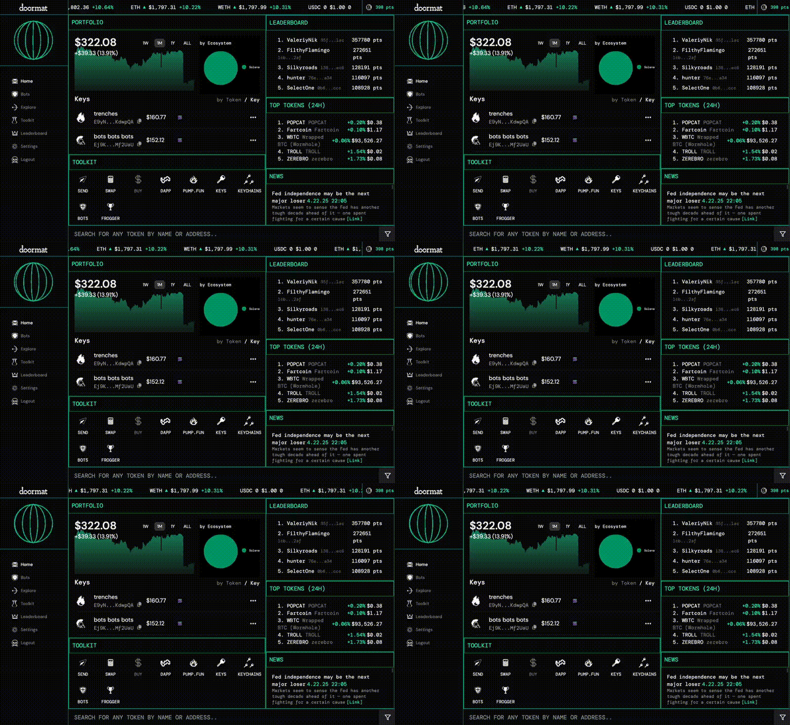
Designed and shipped a multi-device MPC wallet and trading terminal for advanced crypto users
Seam Social
CO-FOUNDER, DESIGN
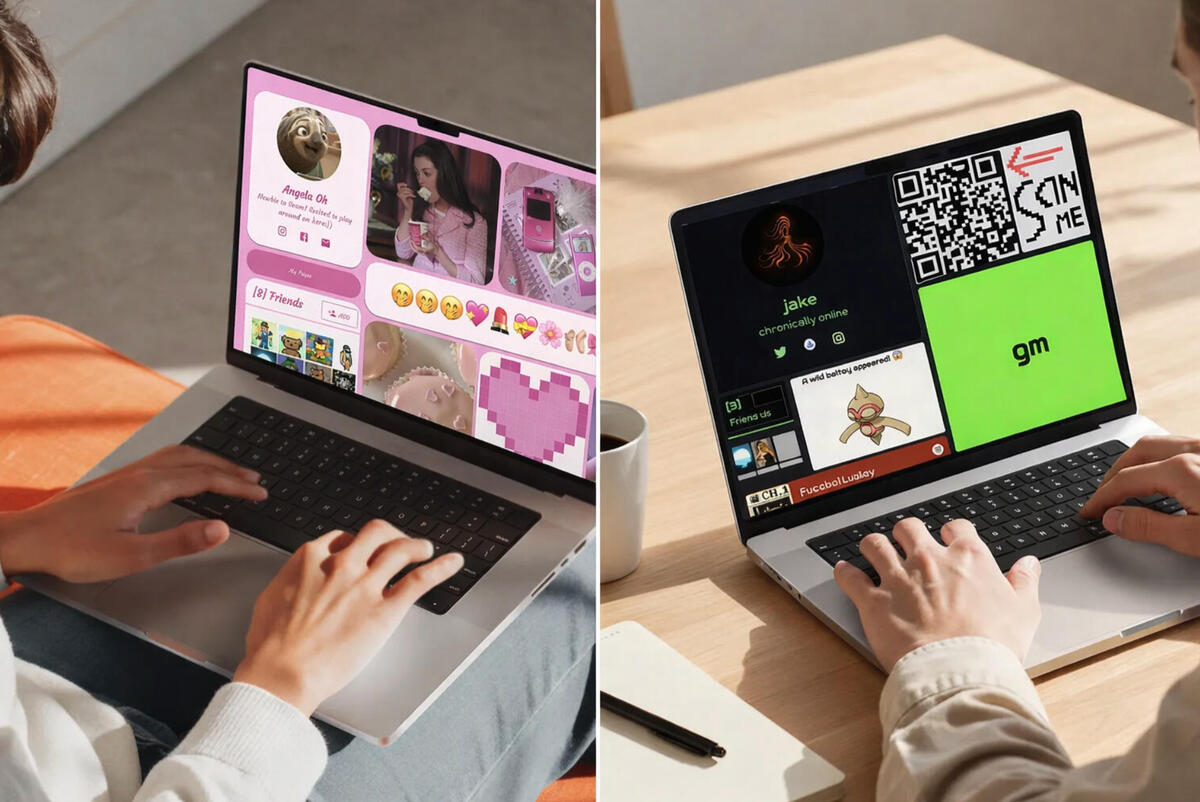
Built a social media platform and SDK from 0 → 1, adopted inside a 250k DAU blockchain game
Taste the City
PRODUCT DESIGN ADVISOR
Supported research, product development, and UX updates for an SMS-guided food tour platform
Mailchimp
2020 | PRODUCT DESIGNER NDA
Agency team extending Mailchimp’s Wink design system into a cross-functional reference platform

A bit about me
What I love most about designing digital products is that there's no final version. The work evolves with shifts in culture, market cycles, and adjacent technology.Day-to-day I enjoy working on ambiguous problems, shipping quickly, and refining systems over time.Recently, I’m thinking about how AI will shape some of our most intimate decisions like managing finances, supporting our health, and helping us maintain human relationships. I believe designing for these futures is a huge opportunity and responsibility.Offline I like pottery, bricking my phone, and adding to my bookshelf. Always open to chat or (ideally) make something cool together, if that sounds fun please reach out.
SIDE PROJECTS
| Reply Girls Podcast | 200k impressions, 500+ collectors | Pods, Youtube |
| Cookbook | 3rd Place, ETH NYC Hackathon (Mantle) | Github |
| Fitcheck iMessage App | Hit #7 in App Store | Archived |
| Common Wallet | 1st Place, Sozu Haus x Climate Hackathon | Website |
| Port Protocol | 1st Place, ETH CC Hackathon (IPFS) | Devpost |
| Seam v1 | Top 5 Finalist, Miami Hack Week | Devpost |
| Friend of the Week | Awarded an Editorial Grant | Archived |
| Moss & Friends Podcast | Hosted 20+ VC-backed healthcare founders | Spotify |
| Alberta Adventures | Top 5, Calgary Open Data Hackathon | Archived |
Mailchimp
Product Designer (Agency) • 2020
I worked on an internal initiative supporting Mailchimp’s Wink design system as part of an agency team assembled by Superfriendly. We partnered with stakeholders across brand, content, and product to explore how Wink could scale shared understanding across the organization.Mailchimp had recently launched Wink, its unified design system, aligning product surfaces visually and technically. While it brought consistency to components, teams were still operating with fragmented documentation and differing interpretations of how the system should be applied.
How can Wink scale shared understanding and creative exploration within Mailchimp?
Constraints
Wink was already established as Mailchimp’s unified design system, so the initiative focused on extending rather than redefining it. The platform needed to support cross-functional alignment without direct ownership of product surfaces.
Cross-functional scope across brand, content, and product teams
Internal-only platform with legacy documentation to reconcile
Evolving stakeholder expectations and shifting business priorities
Exploration
Initial concepts focused on building a centralized reference site for Wink documentation. Through workshops and prototyping, we evolved the direction from static documentation to a living system referred to as the "Wink Playground".We explored:
Defining the core elements that shape the majority of brand expression
Structuring brand, content, and product principles within one framework
Designing governance through structure rather than rigid rules
MY role
Produced visual designs for an internal reference platform
Translated existing brand systems into scalable interface patterns
Worked closely with brand, content, and product stakeholders to validate competing ideas with concrete prototypes
Helped drive alignment in a shifting, high-ambiguity environment
Outcome
The engagement concluded before full implementation, but the work clarified how Wink could extend beyond components into a broader system of shared language and decision-making.
Reflection
Design systems at scale are not just component libraries. They are a collection of shared agreements across different roles and work streams.Consistency comes from clarity of interpretation, not just visual alignment. Building infrastructure for teams requires designing for governance, trust, and evolution over time.
Taste the City
Advisor, Product Design • 2023-2026
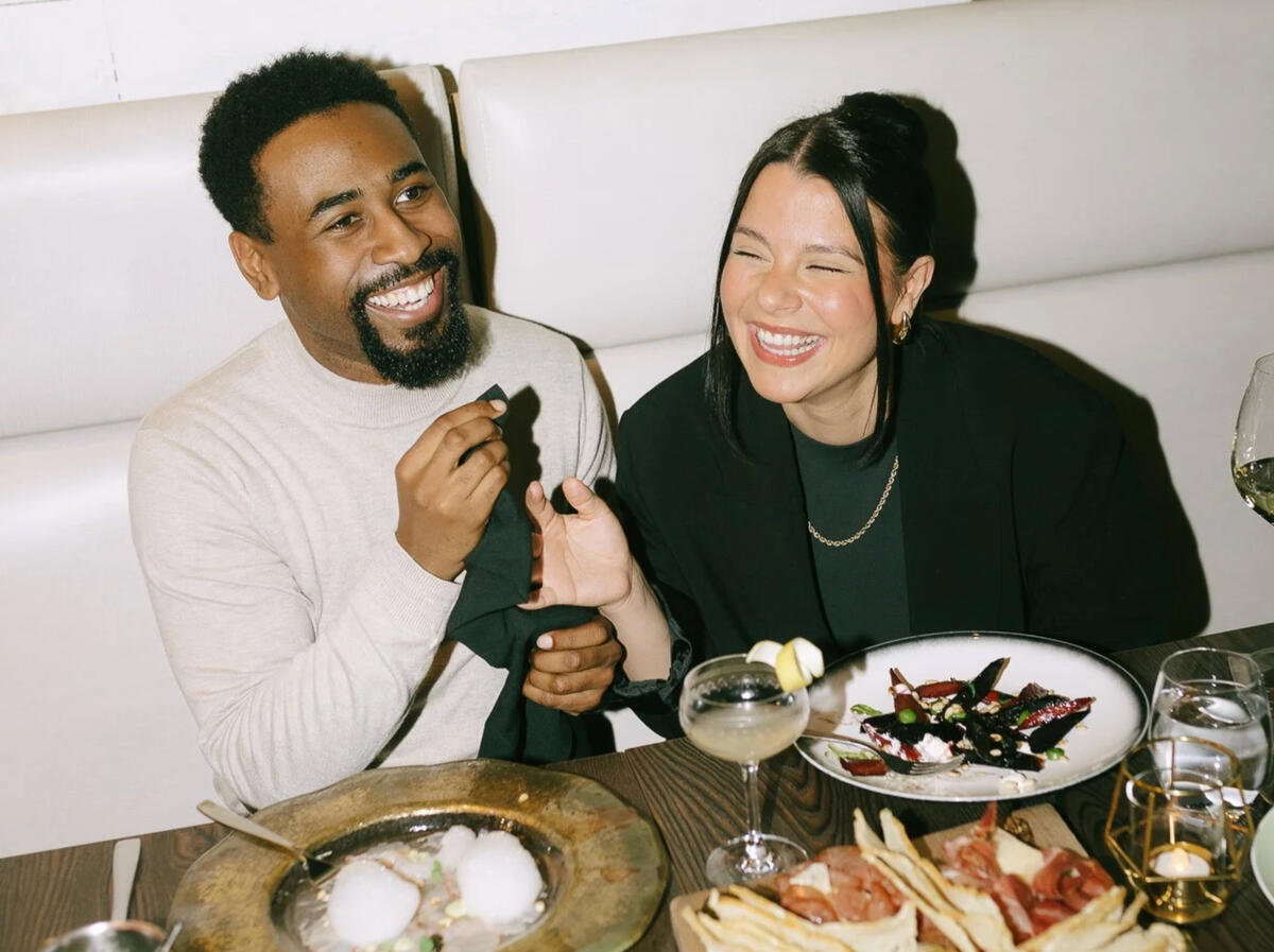
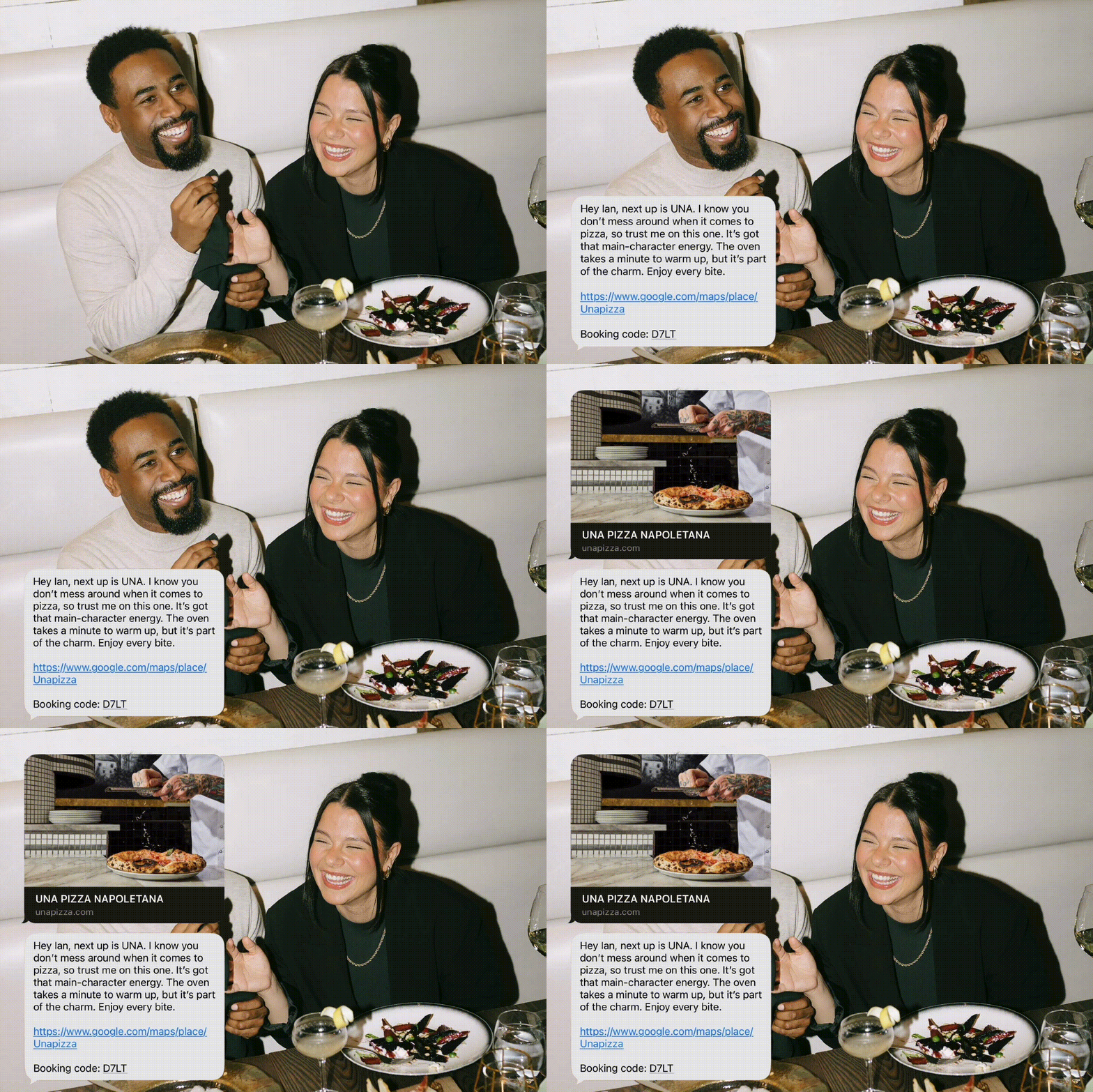
Taste the City is a hospitality marketplace connecting restaurants, curators, and diners through SMS-guided food tours. Content creators curate routes to monetize their recommendations, users book surprise tasting tours, and restaurants get free exposure to new customers.When I started working with the team, their product was live in 100+ restaurants across Canada, generating strong traffic from their social content, but sales lagged. The team was about to fundraise and needed to improve conversion without rebuilding the MVP.
What will make people excited (instead of uncertain) when they pay in advance for a dining experience?
Challenge
The UX wasn’t smooth, so users dropped off while browsing routes and during booking. Visual hierarchy was inconsistent, imagery was deprioritized, and routes lacked enough context to build trust. The on the website UX didn’t match the premium pricing.
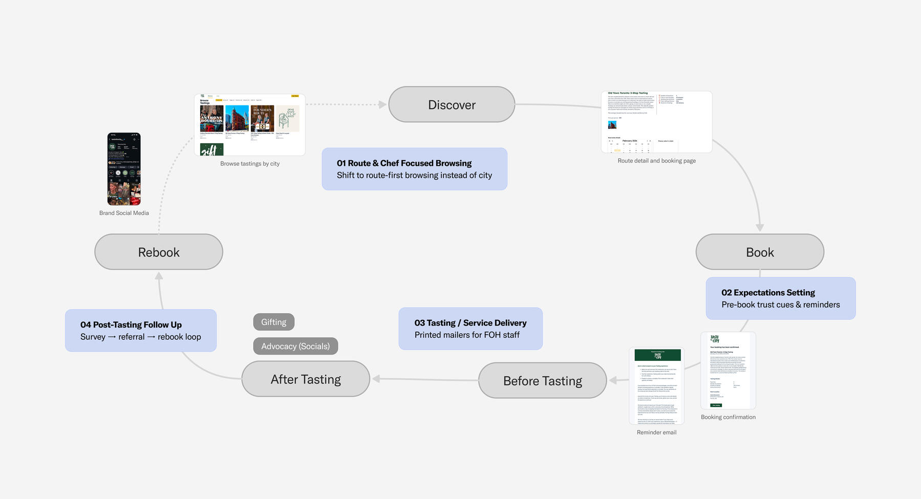
Mapped the end-to-end lifecycle to find the highest leverage opportunities to improve conversion and retention
FOCUS AREAS
I focused on clarifying value, tightening the booking journey, and improving conversion within the existing MVP’s technical constraints.
1. Route-First Browsing
Shifted from city-first navigation to route-first browsing to reduce cognitive load and make curated experiences easier to compare.2. Trust & Expectation Setting
Improved key touch-points and microcopy without introducing major engineering changes, balancing growth goals with MVP limitations.3. Partner Enablement
Created physical and digital touchpoints to reduce confusion, support onboarding, and protect the guest experience at scale.
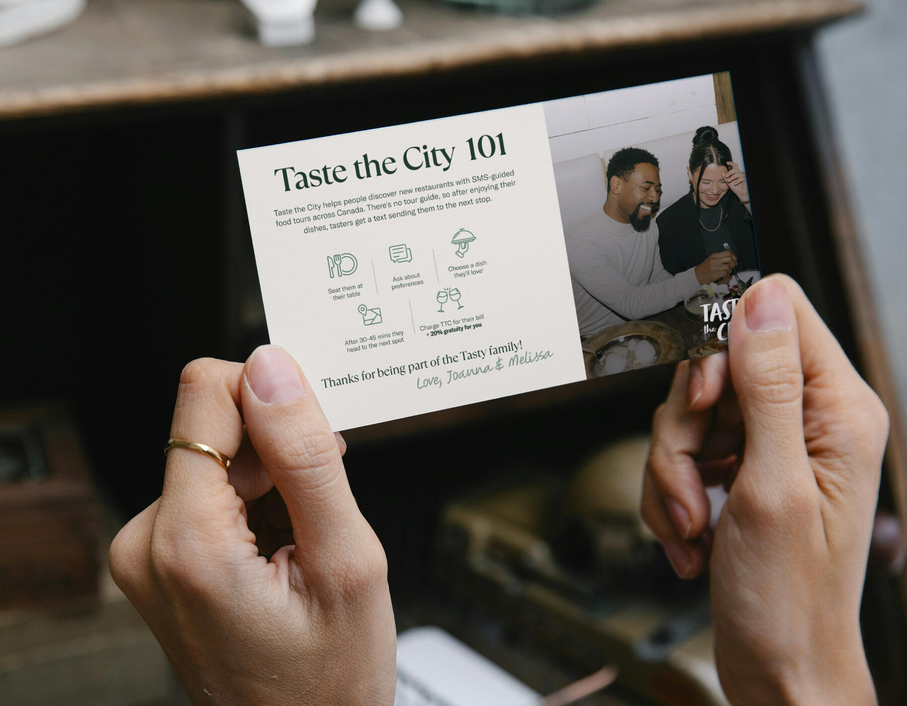
Created a simple printed guide so restaurant partners could confidently deliver the TTC experience
Outcomes
Strengthened conversion and trust without rebuilding the product
Reduced friction across browsing, booking, and service delivery through route-first UX, expectation-setting, and FOH mailers now rolling out to restaurant partners
Refined key microcopy and touchpoints across the journey; redesign is in implementation and active user testing, with early signs of smoother booking and fewer interruptions
Seam Social
Co-founder & Design Lead • 2021-2023
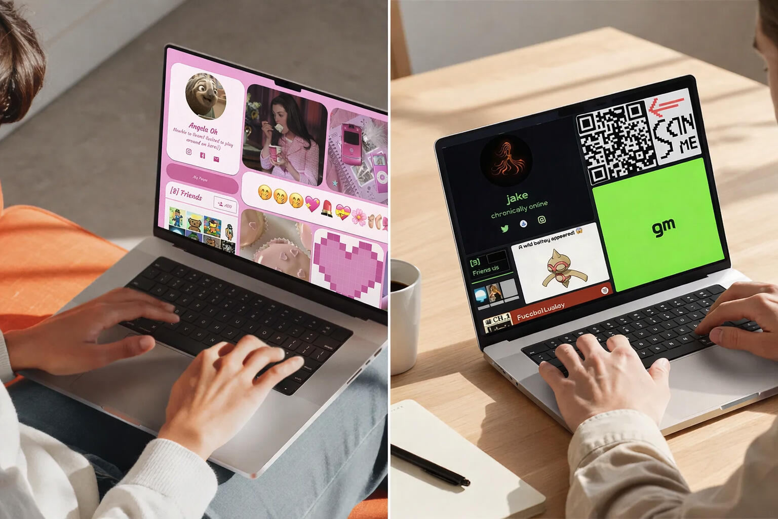
Seam Social is a customizable social platform and SDK that lets users extend identity across games and online communities.I designed the core product and mini app SDK, enabling users to create personalized mini apps, apply themes, and embed their profiles outside the platform.
How might we hack the cold start problem and get distribution for a new type of social media profile?
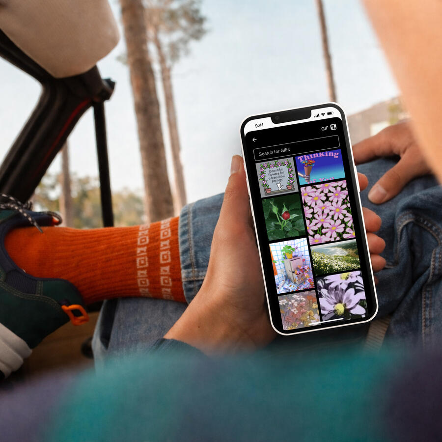
We launched our PWA using Privy
Loading animation
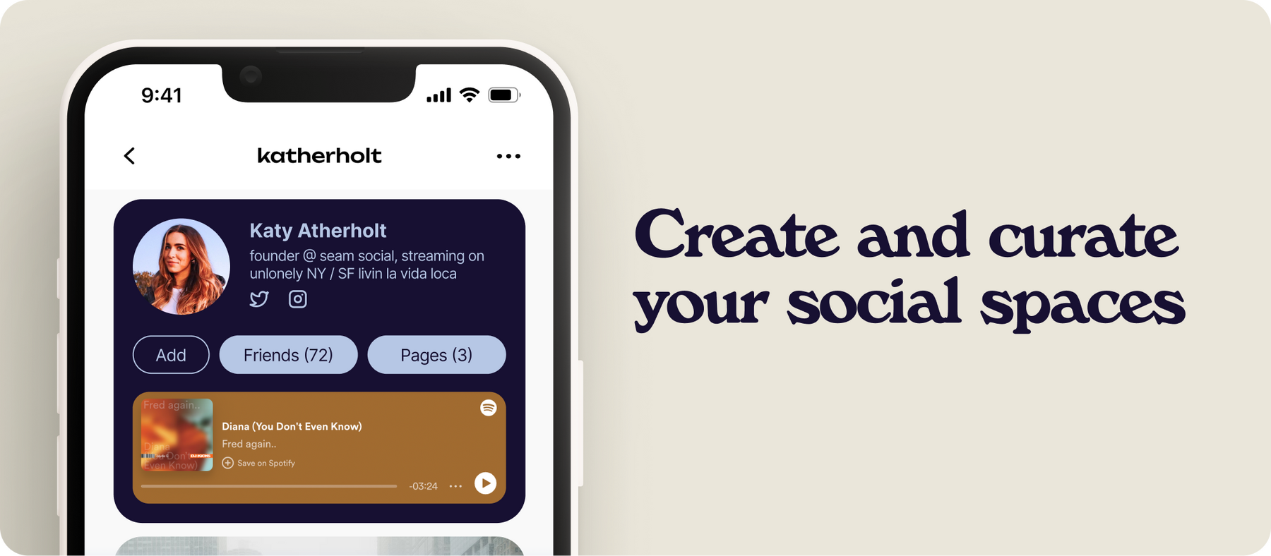
All users set a profile song during onboarding
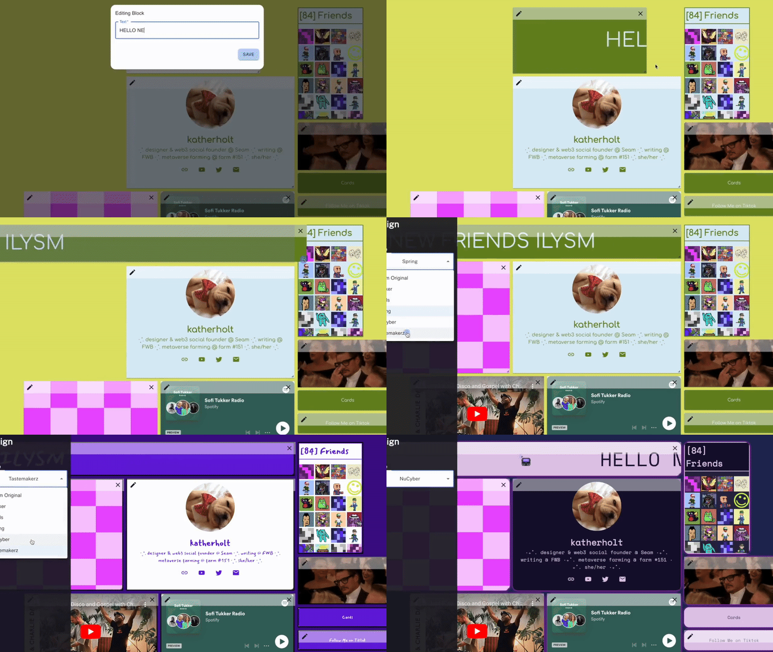
One of many community-requested profile themes
CHALLENGE
Seam faced two cold-start problems: a standalone social platform without users, and an SDK without distribution to attract developers.Without users, developers had no reason to build. Without compelling features from developers, users had no reason to stay.
APPROACH
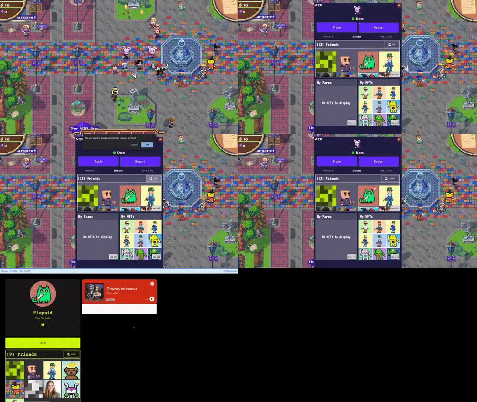
To address the cold start on both the platform and the SDK, I focused on distribution. We built a lightweight integration that embedded Seam profiles and mini-apps directly into Pixels, seeding real usage and attracting developers through a single high-signal launch.
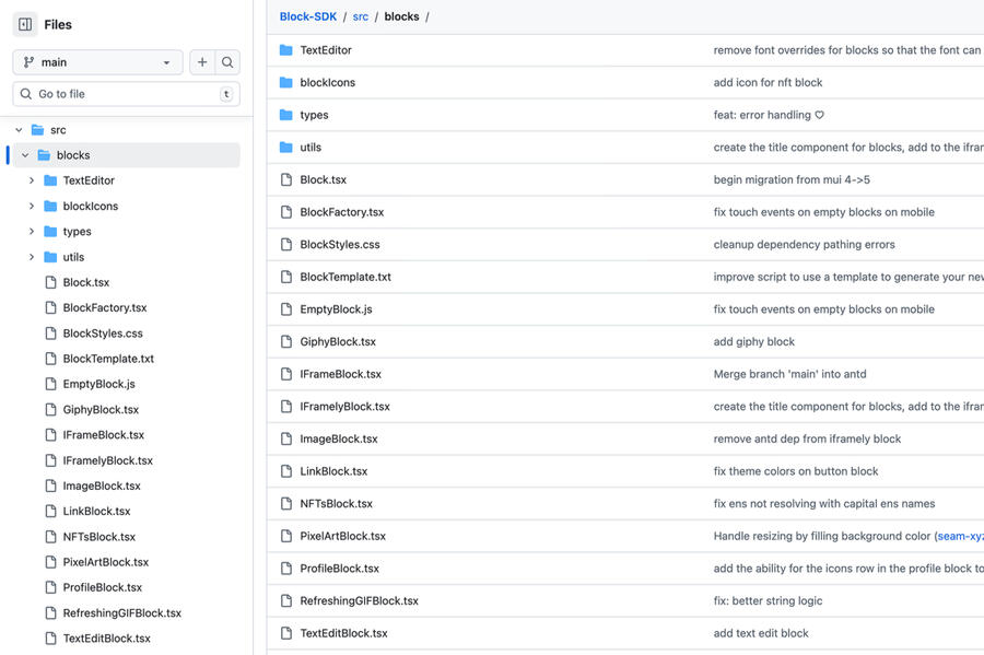
Open source mini app SDK
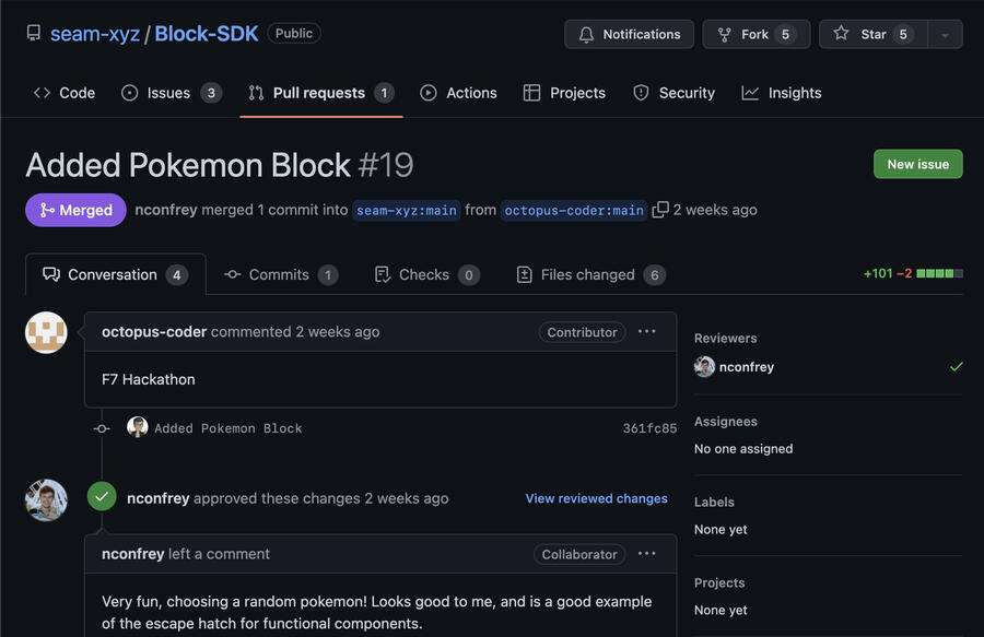
A user-built a Pokemon feature
OPPORTUNITY
Pixels is a top blockchain MMORPG with over 250k DAU ( at the time) and an active social layer, but lacked flexible in-game identity features. This made it an ideal environment to introduce Seam, where profiles could be immediately visible, useful, and socially legible.
Outcomes
Embedding Seam identity directly into Pixels was our strongest go-to-market outcome. The integration also served as a distribution channel for the SDK, leading 12 external developers to build custom features.
Seam had an immediate 10x increase in DAU
Reflection
This project reinforced that distribution-first design beats building standalone for niche products. Embedding Seam's identity into existing social environments through lightweight SDK integration validated demand and focused engineering effort on what actually mattered.
We created custom game objects to gift users with creative profiles
Quests were built into the platform to support onboarding and new feature releases
Doormat Wallet
Founding Product Designer • 2024-2025
Doormat was a self-custody multi party compute (MPC) crypto wallet, leveraging threshold signature signing and distributed key generation. It later became a trading terminal with transaction batching and automation tools for advanced users.I joined as the first product designer as the team prepared to launch the initial MVP. This case study focuses on the key product and design decisions that shaped the path towards product market fit rather than any single product design process or challenge.
MAY 2024
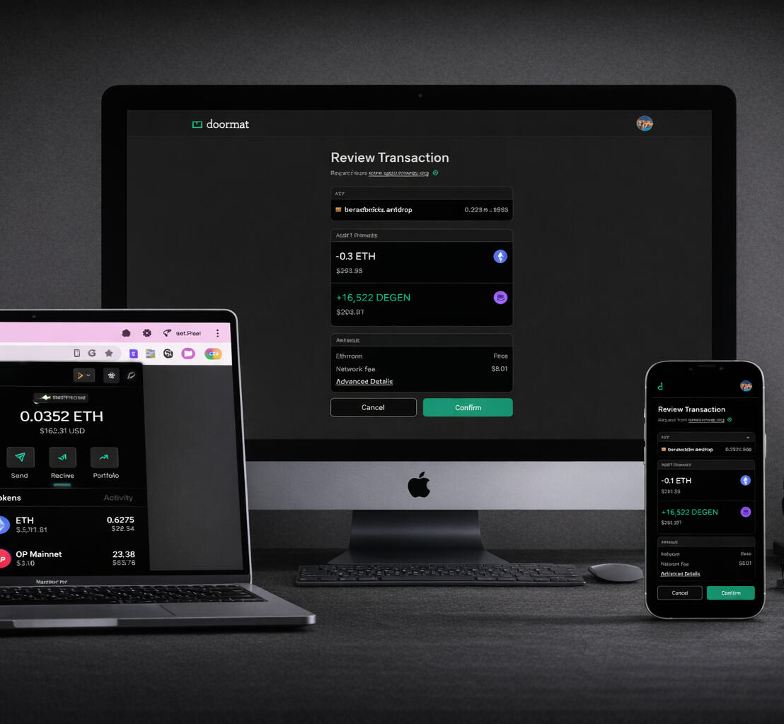
I designed the MVP for our self-custody MPC wallet available on desktop, mobile, Chrome and iOS
Objective
Let users access any key from any of their devices using just a master password and another device to grant permission. This is a unique offering because it allows users to access their assets without entering a seed phrase (or recovery phrase) in new devices.Solution
We built a desktop-first, mobile-friendly web app alongside an iOS app and Chrome extension. Using custom-built MPC key management (not Turnkey or Privy) users could access any EVM or Solana key from any device without seed phrases or custody tradeoffs.Impact
This validated Doormat’s technical foundation and differentiated it from traditional wallets, but also revealed that security primitives alone were not enough to drive repeat usage.
OCTOBER 2024
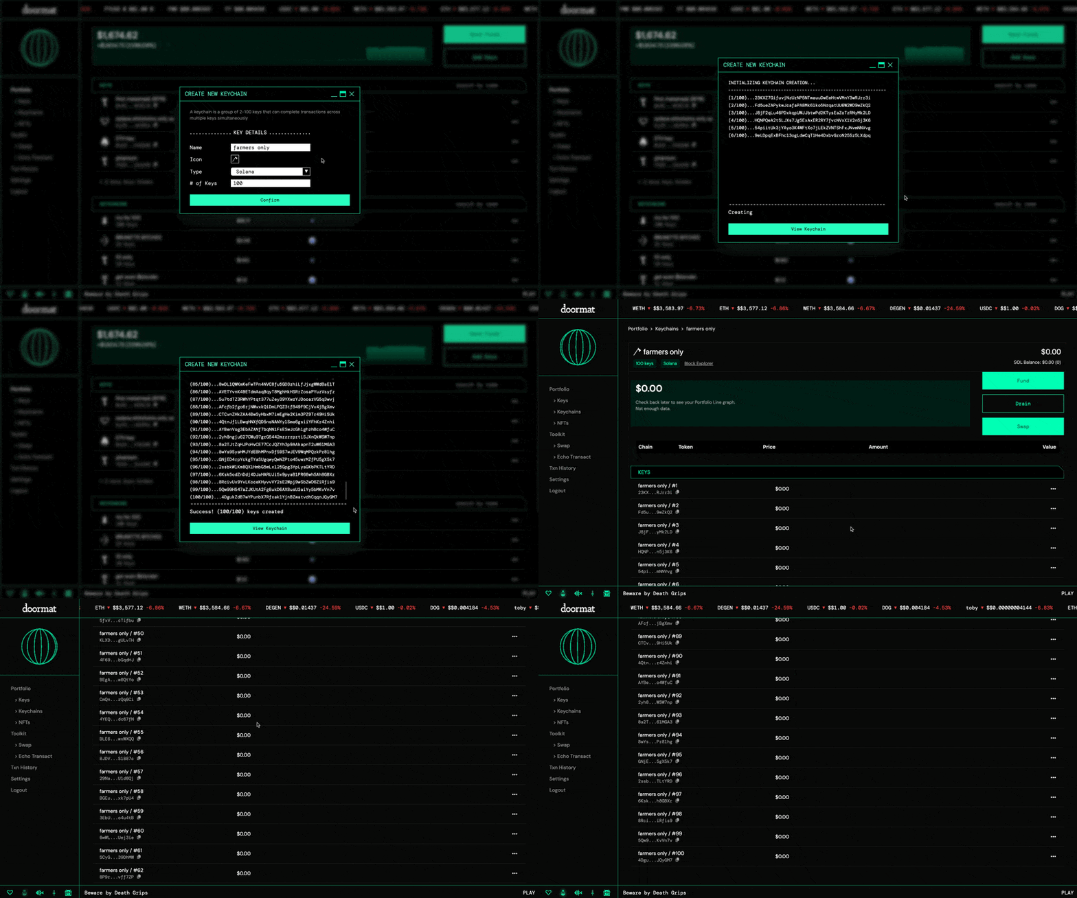
We introduced key orchestration - the Keychains feature - to give power users an execution advantage
Objective
Create a differentiated trading advantage inside the wallet for advanced users.Solution
I led the design of the Keychains feature, a system that lets users generate and manage up to 100 wallets as a single execution unit and submit coordinated transactions across them in parallel.This enabled traders to distribute risk, automate strategies, and execute complex positions without external tooling.Challenges
Keychains introduced significant reliability risk: individual wallets frequently failed mid-transaction, breaking batch execution.I worked closely with engineering to map failure modes, model recovery paths, and design transparent error handling. We shipped a resilient fallback system with granular failure diagnostics and a “Retry Transaction” flow, allowing users to recover partial executions while infrastructure reliability improved.This approach reduced abandoned trades and preserved user trust during periods of network instability.Impact
Keychains repositioned Doormat from a secure wallet to trading execution infrastructure. It became the primary onboarding path for advanced traders and a core driver of power-user retention.
February 2025
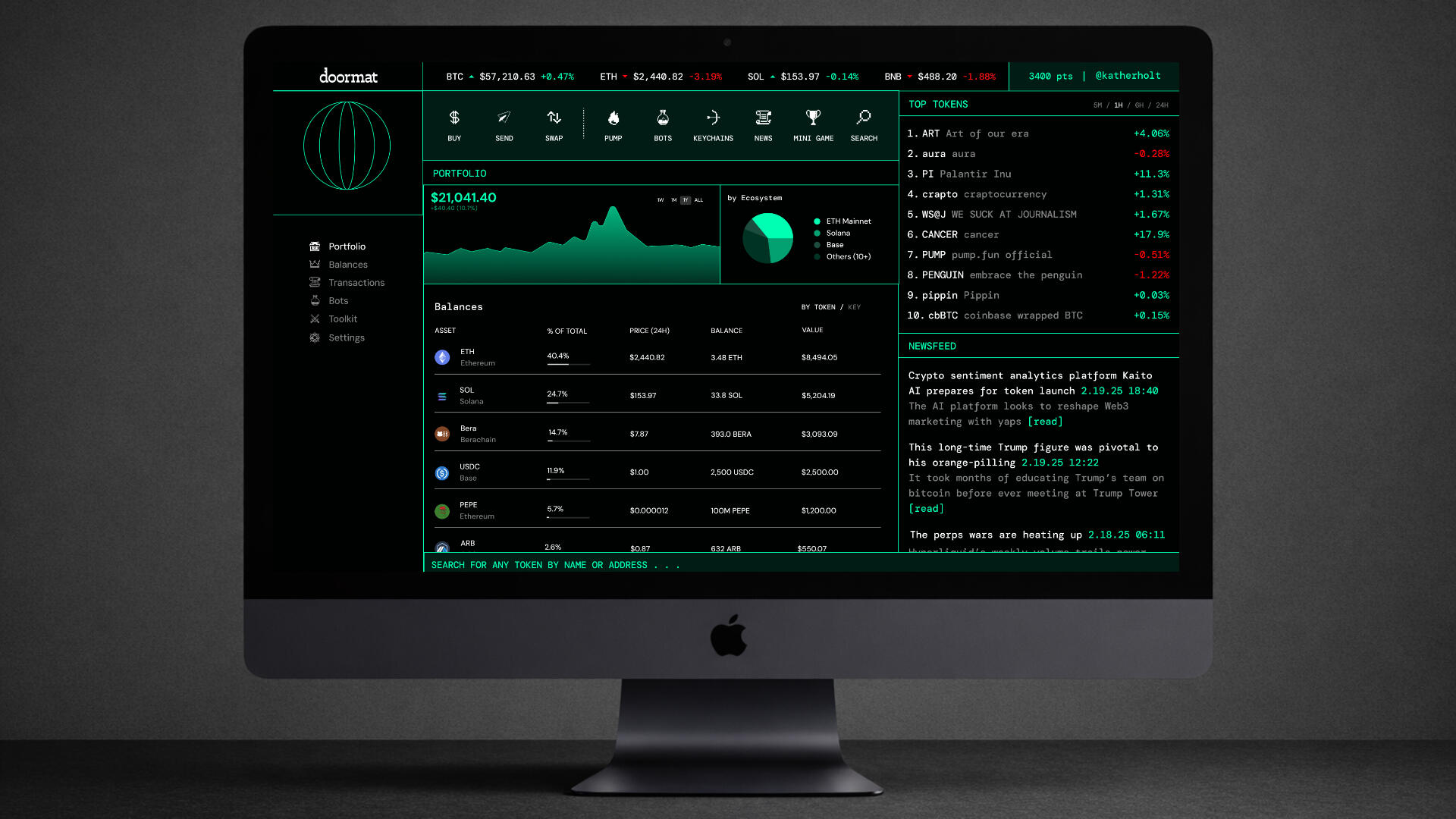
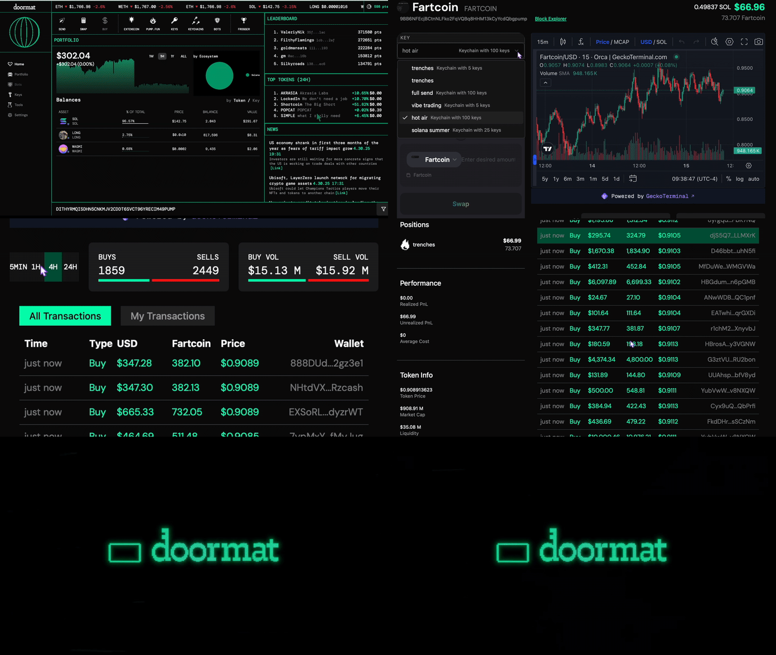
I led a full product redesign from an MPC wallet into a trading platform modeled after the Bloomberg Terminal
Objective
Support faster and more efficient trading workflows without users needing to rely on external tools or navigate outside of the product.Solution
I designed a unified, Bloomberg-style terminal that directly integrated Pump.fun, news, price tickers, live token charts, and a command line interface helping users minimize data fragmentation and execute faster.Impact
The Pump.fun integration became the primary entry point for over 60% of users, lifting 30-day retention to ~50%.
MAY 2025
We enabled automations for trade execution during peak market volatility so users could get some sleep
Terminal-native automation replacing manual scripts, reducing technical barriers without sacrificing control
Objective
Allow users to trade effectively even when offline during fast-moving markets.Solution
We built terminal-native automation rules, ranging from basic protections like stop losses to trading-specific logic such as round-trip protection, replacing brittle custom scripts without hiding complexity.Impact
Automations improved retention among power users and reduced reliance on external tooling, contributing to a ~50% lift in 30-day retention post-launch.
Outcome
Doormat evolved from an MPC wallet into a full trading terminal supporting Solana and EVM chains, Pump.fun integration, automated trading, and Keychains. The product supported 616 alpha users, 8,000+ wallets, $1.9M peak AUM, and $900K in trading volume, validating that power users will adopt complex tools when they meaningfully improve speed, control, and execution quality.
Welcome to my bookshelf!
This is a selection of books I've enjoyed over the past few years. I've been trying to read more fiction (sci-fi especially). Please share your recommendations below!
2026
2025
2024
2023


